Cover Love: How A Book Cover Like The Crossroads Is Created
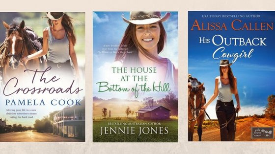
Have you ever wondered how a book cover is created? Readers often ask, so in this post I'll explain how The Crossroads came to have what I think is my favourite of my four published novels.While a (very) few publishers do photoshoots for their book covers most spend hours trawling image libraries for the perfect cover shot. Photographers add their images to these libraries - places like istock, gettyimages, Ozimages - and anyone can log in and buy the photos. The images aren't free - there is a fee that allows the buyer to use the picture for their own purpose, effectively taking ownership of the image.Many publishers - both traditional and independent - use these libraries to find their cover images. This is why you might sometimes see the same person or setting on the covers of a number of books in the same genre. Rural Romance is the perfect example. You'll see very similar looking cottages on a number of the covers. And in the case of myself, Jennie Jones and Alissa Callen, you'll actually find the same girl on the front cover.
While these covers differ in many ways it's obvious that the same girl has been used on all three. This is because a photographer will upload a whole variety of images to the photo library using the same model in various poses. The publisher purchases just the one image - hence the similarities and variations.
When a genre becomes popular it's inevitable that some of the books are going to have the same cover girls (and men). A big part of the marketing strategy is to make books easily identifiable to readers of the genre. In the Rural Romance genre the standard elements for a cover are the attractive protagonist (male or female), an idea of the setting ( generally a paddock, a country-style house, a windmill or another iconic rural image) and of course the book's title and the author's name. These elements immediately mark the books as Rural Romance/Fiction and allow readers to easily find them on the bookstore shelves.
Sometimes authors are lucky enough to have their own amazing photos, especially when it comes to the background setting. This gorgeous cover from Tricia Stringer is a perfect example.
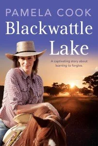
You can find more great rural Romance covers on the Australian Rural Romance website.Waiting for the cover design from your publisher is usually a nail-biting experience. What if the girl on the cover is different from the imagined one in your head? What if you hate it? Who has the final say? As the expert in the field the publisher does make the final decision about the cover image but in my experience there's certainly room for negotiation. The girl on the cover of Blackwattle Lake originally had lighter hair but with the magic of photoshopping she became a brunette to match the character I had created in Eve. And since I was still working on the book when I received the proofs for the cover the horse Eve rode changed from a grey to a chestnut to match the one on the front.
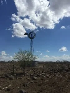
When it came time to do the cover for The Crossroads I was pretty sure it would have a windmill on the front as this was something my publisher had requested when I was deciding on a setting for the story. It would have been nice to use one of the photos I took while I was on my research trip to Hughenden in outback Queensland but none of them were quite right.
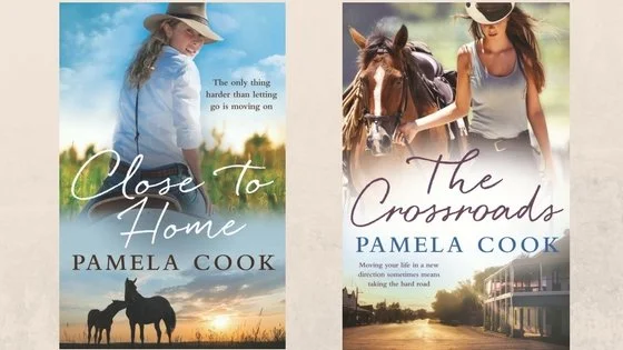
I did, however, browse through the website of a fabulous rural photographer (who I knew of through my horse riding), bellarosefilmandphotography and came across a brilliant one of a country pub. Since the novel is set in a fictional town once again some photoshopping was done to disguise any obvious identifying features and the image was combined with the one of the girl and horse to create the final product. I'd been head over heels with the dual image on the cover of Close To Home and once again I fell madly in love with my new cover. I think they'll look pretty fine beside each other on the book shelf!
The similarity between the covers and the identifying features certainly makes them easier for readers to find. It does lock the books very definitely into a genre though and while that's a great thing on the whole I do think it deters some readers who might dismiss the genre as too 'light' or 'trivial'. Many of the books I've read in the Rural Romance/Fiction genre deal with some very serious issues and have a lot more depth than their covers sometimes indicate. So my suggestion would be to always read the blurb as well as taking in the cover to make sure you don't miss out on a great read.
I'd love to hear about your favourite covers and what you think makes a great cover. Please leave a comment below.
The Crossroads will be released on November 29 and is now available for preorder. Click on one of the links below to preorder now:
Also available on iTunes


